
Let’s have a conversation about color, because getting dressed involves more than finding two garments that do not openly fight with each other.
Color affects how healthy your complexion looks, how your body is perceived, how appropriate your clothes seem for an occasion, and whether separate pieces come together as one deliberate outfit. The right colors can make you look slimmer, taller, healthier, and more confident. The wrong colors can wash out your face, exaggerate your size, divide your body into unflattering sections, or make you look a little like Shamu heading to brunch.
You do not need an art degree or a collection of color wheels to get this right. You need to understand what colors do, determine which ones work best on you, and exercise a little restraint when combining them.
Begin With the Man, Not the Garment
 ◄ View ►
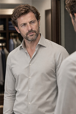
A beautiful color is not necessarily a beautiful color on you.
◄ View ►
A beautiful color is not necessarily a beautiful color on you.
Your skin tone, hair color, eye color, and natural level of contrast all affect how a garment looks once you put it on. A pale blue shirt may make one man’s eyes look striking while leaving another man looking as though he has not slept since Tuesday. A rich orange shirt may give one complexion warmth and life while making another appear ruddy.
This is why judging a shirt on a hanger tells you very little. Hold it near your face or, better yet, put it on and stand in natural light. Look at your face before you admire the shirt.
Does your complexion appear clearer? Do your eyes become more noticeable? Do you look healthy and awake? Or do you suddenly notice every red area, dark circle, and uneven patch of skin?
A color that makes the garment look wonderful has done its job for the store. A color that makes you look wonderful has done its job for you.
Understand Warm and Cool Colors
Most colors lean either warm or cool.
Warm colors include red, orange, yellow, brown, tan, camel, and cream. These colors contain visual warmth and often work naturally with gold jewelry, warm leather, and other earth-toned clothing.
Cool colors include blue, green, violet, and many blue-based shades of gray. These generally work well with silver jewelry, black leather, and other cool-colored garments.
Black, white, and some grays can serve as dependable foundation colors, although even white and gray may lean warmer or cooler depending on their undertones. Navy is technically a cool color, but it is so versatile that it can perform much like a foundation color in a man’s clothing.
Brown, tan, camel, and cream should not be thrown into a catchall neutral category. They are warm colors. Calling them neutral does not remove their warmth or guarantee that they will work with everything else you own.
A camel jacket, cream shirt, and brown trousers can form an attractive warm combination. That does not mean the camel jacket automatically belongs with every cool shirt hanging beside it.
Pay Attention to Contrast
 ◄ View ►
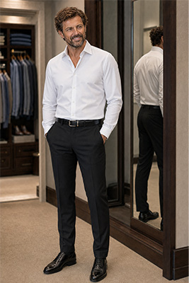
Some men look best in strong contrast. Others look better when their colors are more closely related.
◄ View ►
Some men look best in strong contrast. Others look better when their colors are more closely related.
A man with very dark hair and a lighter complexion often carries black and white, navy and white, or another high-contrast pairing particularly well. His own coloring already contains strong contrast, so the clothing echoes what is naturally present.
A man whose hair, skin, and eyes are closer in value may look better in combinations with less dramatic separation, such as medium blue with charcoal or a light blue shirt beneath a navy jacket. Extremely sharp contrast can sometimes overpower him and cause the clothes to enter the room before he does.
Contrast also affects how your body is divided. A bright shirt with very dark trousers creates a clear horizontal break at the waist. That can be useful when you want to balance a long torso, but it can work against you when you want to appear taller or leaner.
When the colors above and below your waist are similar, the eye travels vertically with fewer interruptions. That creates a longer, cleaner line.
Color Can Make You Look Slimmer or Larger
 ◄ View ►
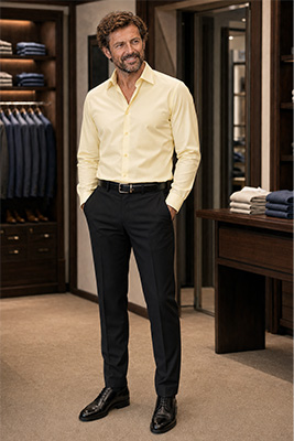
Dark colors absorb more light and generally make an area recede. Light and bright colors reflect more light and bring an area forward. That is why a dark shirt can make a large torso look somewhat smaller while a pale or brilliant shirt may emphasize its size.
◄ View ►
Dark colors absorb more light and generally make an area recede. Light and bright colors reflect more light and bring an area forward. That is why a dark shirt can make a large torso look somewhat smaller while a pale or brilliant shirt may emphasize its size.
This does not mean that a larger man must dress in black every day. It means he should understand where he is placing visual attention.
If your upper body is considerably larger than your lower body, a bright shirt worn with very dark trousers may exaggerate that difference. A deeper-colored shirt with trousers of a similar visual weight can create better balance. If your lower body is larger, very light trousers may place more attention exactly where you do not want it.
Fit and fabric still matter. A tight black shirt does not become flattering merely because it is black, and a shiny dark fabric may reflect enough light to reveal every contour underneath it. Color can help establish the line, but it cannot rescue clothing that is too tight, too loose, or poorly cut.
The most slimming approach is usually a largely uninterrupted column of color, supported by proper fit. Dark navy with navy, charcoal with black, or black from top to bottom allows the eye to move vertically instead of stopping at a series of contrasting blocks.
As for my personal color choices, nothing works better on me than all black worn with my three-inch elevated shoes. Together, they make me appear about twenty pounds thinner and approximately five inches taller. I reserve that look for date nights, weekend bar hopping, and certain semiformal occasions because it creates a stronger impression than I need for an ordinary afternoon.
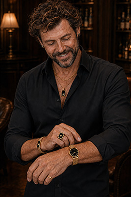
Sometimes I wear gold jewelry because black and gold were meant for each other. At other times, I wear silver jewelry with it. I also have my trademark version in which everything is black, including the jewelry. The outfit works visually, but what matters just as much is how I feel wearing it.
Solids, Patterns, and the Size of the Body
 ◄ View ►
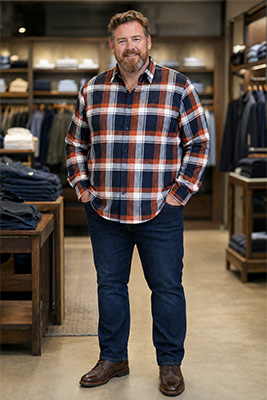
Patterns attract attention and create movement. The larger, brighter, and more contrasting the pattern, the more visual space it usually occupies.
◄ View ►
Patterns attract attention and create movement. The larger, brighter, and more contrasting the pattern, the more visual space it usually occupies.
When I was morbidly obese, solid colors helped me look thinner. One of my most useful combinations was a solid T-shirt worn beneath an open button-up shirt. The uninterrupted color through the center created a vertical line, while the open outer shirt formed two additional vertical edges. It did not make the weight disappear, but it presented my body more favorably.
Large checks, broad horizontal stripes, and oversized prints can make a substantial body look even larger. Tiny, busy patterns may not be much better because they can create visual commotion across a wide area. A restrained pattern, a subtle vertical stripe, or a low-contrast design is often more flattering.
Body size is not the only consideration. A very thin man may benefit from some pattern, texture, or horizontal movement because it can add visual substance. A tall man can often carry larger patterns more comfortably than a shorter man, whose body may be overwhelmed by them.
The pattern should be in proportion to the man wearing it. You should be seen wearing the shirt. The shirt should not appear to be wearing you.
Build the Outfit Around One Dominant Color
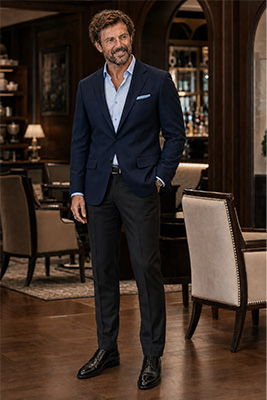 A good outfit does not need six colors competing for custody of your body.
Choose one dominant color first. This will usually be the largest visible area, such as your shirt, jacket, or trousers. Add a second color that supports it, then use a smaller accent if the outfit needs one.
A navy jacket, light blue shirt, and charcoal trousers work because the colors are related, restrained, and balanced. A warm brown jacket, cream shirt, and darker brown trousers work for the same reason within a warmer family.
The accent might come from a pocket square, watch strap, bracelet, belt, or a small detail within the shirt. It should finish the outfit rather than hijack it.
Repeating a color can help connect separate parts of the outfit. A brown belt and brown shoes create continuity. A small amount of blue in a patterned shirt can relate to navy trousers. The colors do not have to match precisely, but they should look as though they were introduced to one another before leaving the house.
Keep Red and Green Apart
 ◄ View ►
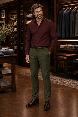
Any combination of red and green is taboo.
◄ View ►
Any combination of red and green is taboo.
That includes the obvious bright red and green, but it also includes their more sophisticated relatives. Burgundy does not belong with olive. Maroon does not belong with sage. Wine does not belong with forest green.
Making the colors darker, dustier, or more expensive does not change the family relationship. You may think you have created a subtle autumn combination, but other people may see a Christmas display that has been sitting in the window too long.
Red-family colors and green-family colors can each be attractive when paired properly. Burgundy can look excellent with black, charcoal, navy, or certain grays. Olive can work with cream, tan, brown, black, or selected blues. They simply should not be worn together.
There are too many good color combinations available to spend time trying to rehabilitate one that begins with a built-in problem.
Let the Occasion Influence the Color
Color also communicates mood and formality.
Black, charcoal, navy, and deep jewel tones generally appear more formal and controlled. Lighter colors, brighter shades, and playful patterns tend to feel more casual. This is why a pale tropical print may be perfect for an outdoor summer gathering and entirely wrong for a serious evening event.
Daytime occasions usually tolerate more light and color. Evening occasions often favor deeper shades, stronger contrast, and more polish. Seasonal surroundings matter as well. Lighter blues, clear whites, and brighter colors naturally feel at home in spring and summer, while burgundy, camel, brown, charcoal, and deeper blues tend to feel richer during fall and winter.
None of this requires you to dress like the decorations. You are attending the holiday party. You are not applying for work as the centerpiece.
Use Jewelry to Support the Color Story
Jewelry is another color within the outfit, whether men think of it that way or not.
Gold usually complements warm colors particularly well. Brown, camel, cream, orange, and many reds gain richness beside gold. Silver naturally complements blues, cool grays, black, and other cool colors. Either metal can work with black or dark navy, depending on the effect you want.
If you mix metals, do it deliberately. Randomly wearing a gold watch, silver chain, black bracelet, and rose-gold ring can make the outfit look assembled from the contents of four different drawers. Repeating a metal or coordinating the overall theme creates order.
Black clothing with gold jewelry appears warm, rich, and dramatic. Black with silver looks cooler, sharper, and more modern. Black jewelry against black clothing creates a controlled tone-on-tone effect in which texture and finish become more important than contrast.
Test the Complete Outfit
Never decide whether colors work together by holding two garments several feet apart.
Put on the complete outfit, including the shoes, belt, outer layer, and jewelry. Stand before a full-length mirror in good light. Then take a photograph.
The mirror lets you examine details, but the photograph often reveals the overall balance more clearly. Look for the first place your eye goes. If one bright garment, bold pattern, or contrasting accessory demands all your attention, decide whether that was your intention.
Also check the outfit under the lighting in which it will actually be seen. Store lighting can distort colors, and warm indoor bulbs can change how blues, grays, and skin tones appear. Natural daylight remains one of the best ways to judge whether a color truly works on you.
Over time, you will recognize the colors that consistently produce compliments and confidence. Record them in your phone along with the brands and sizes that fit you well. That small personal color guide will make future shopping faster and prevent you from repeatedly trying shades that have already failed their audition.
Wear What Gives You Confidence
 ◄ View ►
Color rules provide guidance, not a substitute for personality.
◄ View ►
Color rules provide guidance, not a substitute for personality.
You may own a technically perfect shirt that does nothing for your confidence. You may also own an unconventional color that makes you stand straighter, smile more, and walk into a room feeling completely in command. That reaction matters.
The goal is not to wear whatever everyone else is wearing. It is to understand what flatters your complexion, improves your proportions, suits the occasion, and still feels like you.
Learn why certain colors work. Notice how they affect your face and body. Build combinations deliberately. Then wear the ones that make you feel confident, because confidence remains the one color that looks good on every man.